


Your resume is often the first impression you make on potential employers.
A well-designed resume with visual appeal can help you stand out in a competitive job market.
One important design choice many job seekers face is whether to use colors in their résumés.
This article examines the benefits and drawbacks of using colors in resumes.
We’ll cover color psychology, recommend the best color palettes, suggest professional fonts, and share best practices to help you make an informed decision.
Should You Use Color on Your Resume?
Adding color to your resume depends on industry, role, and branding goals.
Here’s what you need to know about the advantages and disadvantages of using color on your resume.
Benefits
Adding color to your resume can offer several advantages:
- Makes your resume stand out: Thoughtful color catches the eye in stacks of black-and-white resumes, helping you get noticed quickly.
- Highlights key sections: Colors draw attention to headings and achievements, creating a visual roadmap for recruiters.
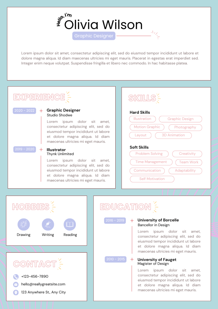
- Shows creativity: For design roles, colors demonstrate visual understanding and turn your resume into a portfolio piece.
Drawbacks
However, there are potential downsides to consider:
- May appear unprofessional: Conservative industries like banking and law often view colored resumes as inappropriate.
- ATS compatibility issues: Tracking systems may struggle with colored text, potentially filtering out your resume automatically.
- Content distraction: Poor color choices can shift focus away from your qualifications to visual elements instead.
Resume Color Psychology
Colors trigger emotional responses and create subconscious impressions.
Understanding how different colors affect perception can help you choose the right ones for your resume.
How Colors Influence Perception
Different colors create different impressions in the minds of recruiters:
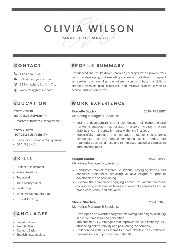
- Blue: Conveys trust and professionalism. Ideal for corporate, finance, or trustworthiness-focused roles.
- Green: Represents growth and balance. Suitable for sustainability, healthcare, education, or development roles.
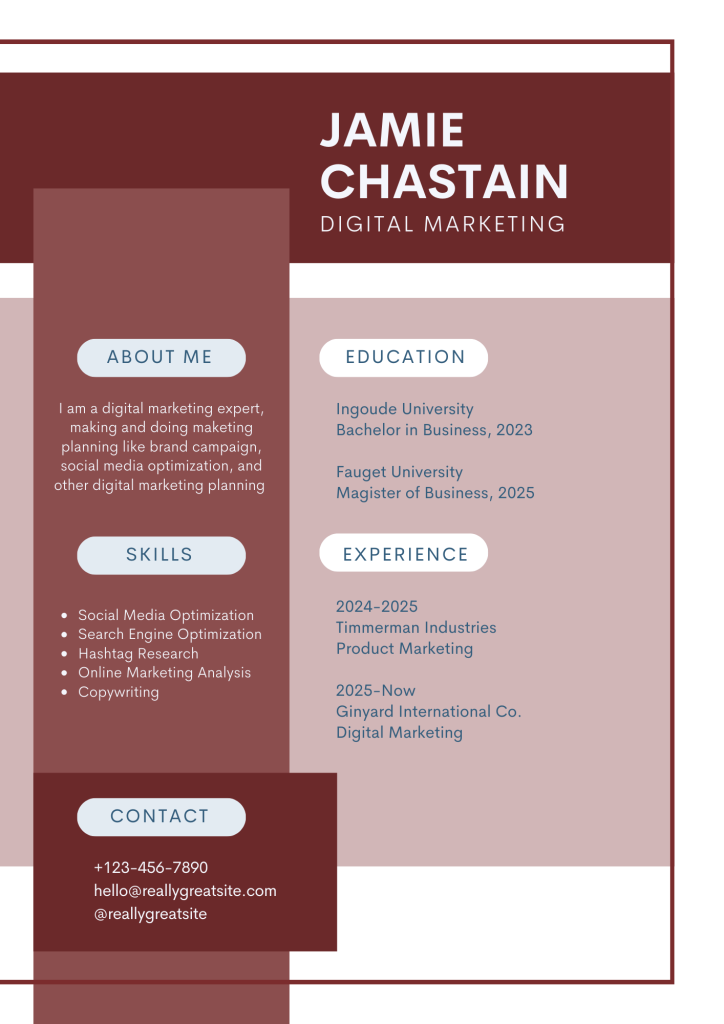
- Red: Shows energy and passion (use sparingly). Best for small accents or creative fields only.
- Yellow/Orange: Suggests creativity and optimism. Perfect for marketing, advertising, design, or startups.
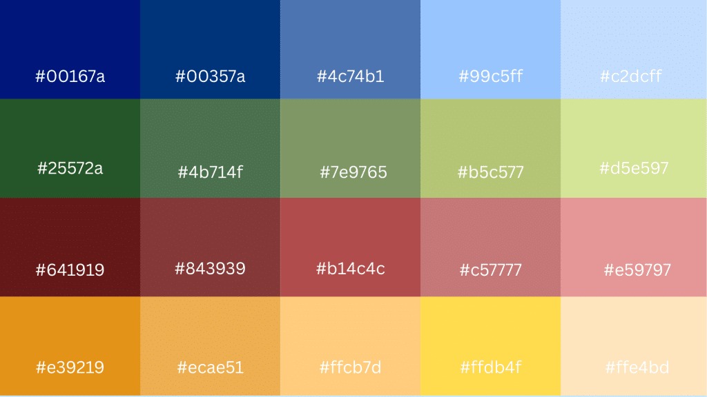
Industry-Specific Color Recommendations
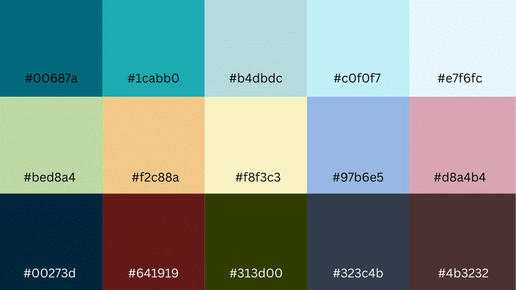
- Creative Industries: Teal, burgundy, and subtle pastels help emphasize creativity and individuality.
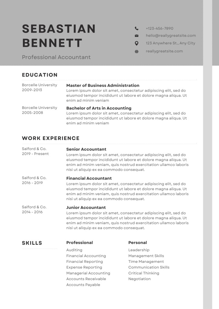
- Corporate/Conservative Fields: Navy, gray, and black convey professionalism and trustworthiness.
- Brand Matching: Consider using colors that align with the target company’s branding for added relevance.
Color Choices by Resume Type
Different resume formats and career stages benefit from specific color approaches:
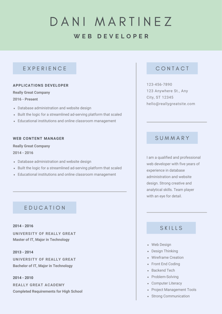
1. Entry-Level Resumes
Soft blues or muted greens project reliability and growth potential without appearing overly bold.
These colors help new graduates appear mature and professional, while also showing their eagerness to learn.
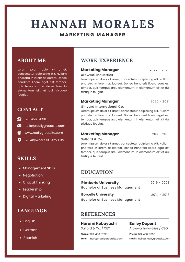
2. Executive Resumes
Deep navy, charcoal gray, or burgundy convey authority and senior-level professionalism.
These sophisticated colors reflect the gravitas and decision-making responsibility expected at leadership levels.
3. Creative Portfolio Resumes
Vibrant teals, warm oranges, or sophisticated purples showcase artistic flair and design sensibility.
Bold color choices demonstrate creative confidence and help portfolios stand out in competitive creative markets.
4. Technical/IT Resumes
Clean blues or subtle grays reflect precision and technical competence.
These colors suggest attention to detail and systematic thinking that employers value in technical roles.
5. Career Change Resumes
Neutral colors, such as gray or navy, help maintain focus on transferable skills rather than visual elements.
Conservative color choices prevent distractions while candidates reposition their experience for new industries.

6. Academic Resumes
Traditional black with minimal accent colors maintains scholarly professionalism.
This approach respects academic conventions while ensuring content remains the primary focus for hiring committees.
7. Sales/Marketing Resumes
Strategic use of brand-aligned colors or confident reds demonstrates marketing awareness and boldness.
These color choices show understanding of branding principles and willingness to take calculated risks.
Choose resume colors that match your career stage and industry expectations to strengthen your professional presentation and impact.
Best Fonts for Resumes
Typography works hand-in-hand with color choices to create a polished, readable resume.
The right font enhances your message while maintaining professional standards.
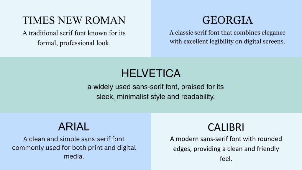
Professional Serif Fonts
Traditional fonts with small decorative strokes that convey formality and established credibility:
- Times New Roman: The gold standard for formal documents, ideal for traditional industries like law, academia, or government positions.
- Georgia: Designed for screen reading with excellent readability and a slightly more modern appearance.
Professional Sans-Serif Fonts
Clean, modern fonts without decorative strokes that offer crisp readability across all platforms:
- Arial: Clean, simple, and universally compatible across all systems and ATS platforms.
- Calibri: Microsoft’s default font with friendly yet professional rounded edges and a contemporary feel.
- Helvetica: A design classic popular in creative and tech industries for its modern, minimalist look.
Readability Tips
These font guidelines will ensure your resume remains professional and easy for recruiters to scan:
1. Keep font size between 10 and 12 points:
Smaller fonts strain the eyes and may appear cramped, while larger fonts waste valuable space and can look unprofessional.
11 points is often the sweet spot for most fonts.
2. Limit to 1-2 fonts for consistency:
Using too many fonts creates visual confusion and appears amateurish.
Choose one for headings and another for body text, ensuring they complement each other well.
3. Pair headings with complementary fonts for visual hierarchy:
Use a sans-serif font for headings (like Helvetica) paired with a serif font for body text (like Georgia), or vice versa.
This creates a clear distinction between different content levels.
Conclusion
Strategic use of color and font can make your resume visually appealing while maintaining professionalism.
Choose colors that match your industry expectations and company culture.
Conservative fields prefer traditional black-and-white resumes, while creative industries welcome thoughtful color choices.
Remember that content remains most important, and colors should enhance, not overshadow, your qualifications.
Ready to create your standout resume?
Experiment with different color combinations that best represent your professional brand.
Frequently Asked Questions
How Do Colors Affect a Recruiter’s Perception of a Resume?
Colors create impressions based on industry and company culture. Professional colors like blue and navy build trust, while bright colors may seem unprofessional in conservative fields.
Can I Use Multiple Fonts if My Resume Has Sections Like Skills and Experience?
Yes, but limit yourself to 1-2 fonts maximum. Use one font for headings and another for body text to create a visual hierarchy while maintaining consistency.
Which Color Palettes Are Safest for Corporate vs. Creative Industries?
Corporate industries prefer navy, gray, and black with minimal accents. Creative industries allow more flexibility with teal, burgundy, or subtle pastels.